The task was to design a logo for a retro video store that focuses on physical media. The target audience for this store was intended to be people ages between 20 and 40 years. The store is also intended for retro-tech enthusiasts and customers driven by experience.
The primary identity of the store is rental services, with retail sales being a side thought. While the main competition for the store ends up being other physical rental stores, with secondary competition being streaming services and resale platforms.


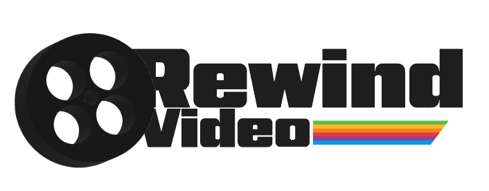
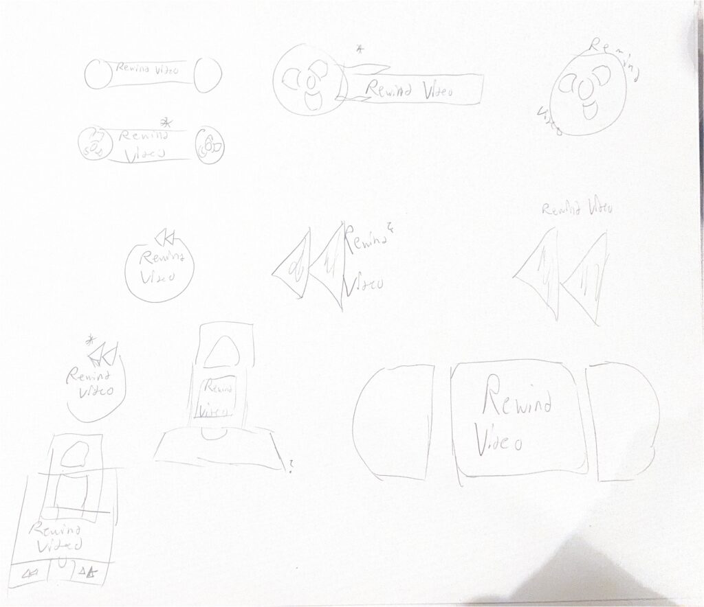
The design I was aiming for leaned more into “old” film media, while the first thought may be to lean for cassette tapes or VHS tapes, I believed it would be more fitting to lean towards older film reels, creating a unique shape and language that would present itself separate from competitive brands. This shape allows for a streamlined design that incorporates the language of the brand with the design to best represent it.