
A project I had to recently work on was the designing of a non-profit cancer group for children’s cancer, I chose to create a group named “Children’s Cancer Group”
The logo design I chose to do for it eventually became three letter blocks stacked together, since it was something that could be visually distinctive, while also being “kid-like” enough to be a viable design
The color palette chosen for this project was rather straight forward, brownish hues for the “wood” sections, with distinctive vibrant colors for the box lettering, representative of many kids toys and kids media that prioritizes saturated environments to stand out as unique.
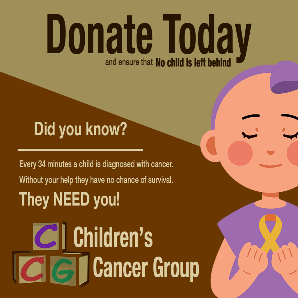
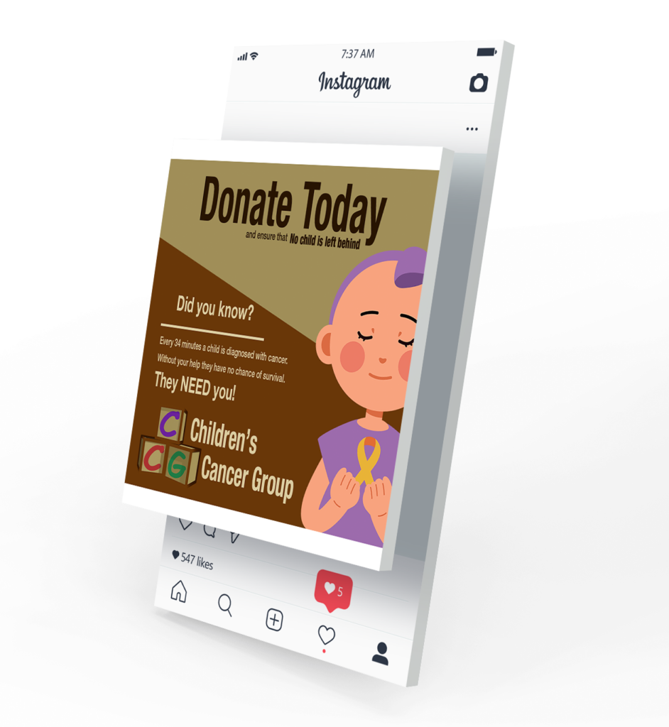
I then was tasked with creating a social media mockup themed around this brand, which I created using Adobe Photoshop, which i designed to be rather vibrant alongside the organization logo itself, connecting the themes.