
The Task for this assignment was to find packaging within a supermarket and redesign it to be “cleaner” and “newer.”
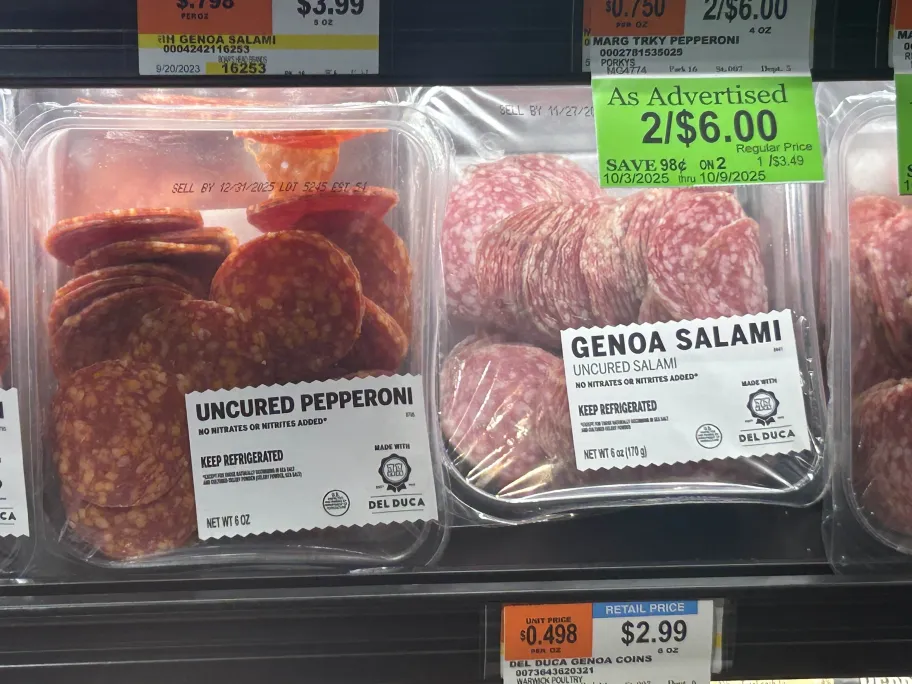
My choice for subject was a package of Uncured Pepperoni and Uncured Salami. I believed the design for the labelling was too generic and same-y, which could cause confusion between the two since they’re very similar on first glance.
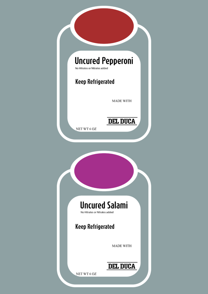
My first design attempt involved creating a inherently larger design, using transparency to maintain some of the internal view of the packaging. I also decided to use the colors Red and Purple to distinguish between the two different types of flavors.
After presenting this variation of the design, I was given feedback regarding the idea that perhaps the original packaging was supposed to look “bland” on purpose since it was a store brand product. This ended up contributing to my observation that the spike edges on the original design are an efficiency thing, allowing for easier separation from print sheets.
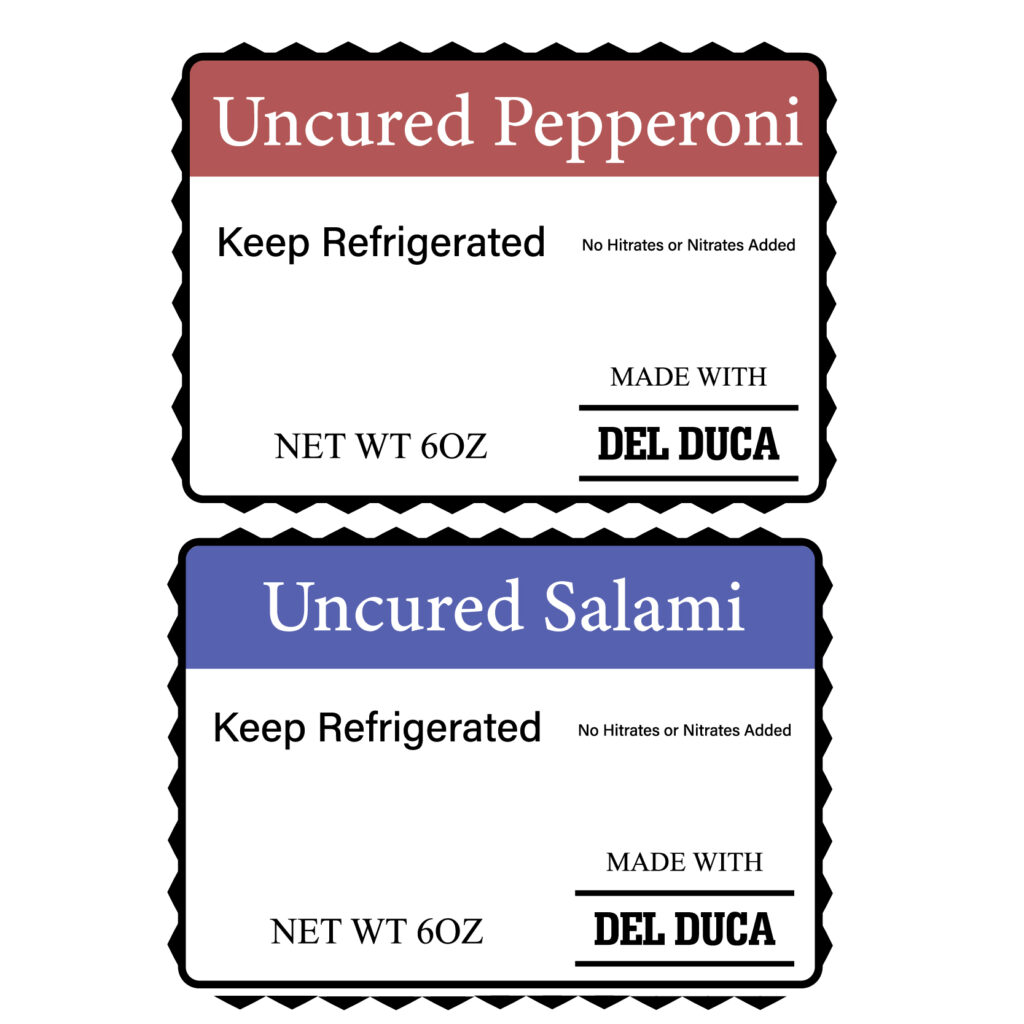
Eventually I finalized on the final design, which shares many similarities with the original package design. Overall this project ended up teaching me ways that a design can be basic, but also have a specific utility to it’s design. While I ended up keeping the basic design of the original, I did do minor changes such as keeping the unique colors, even though the rest of it ended up returning to form.