The premise of this task was to take the existing seal design of a town, and give it a modernization and update to adhere to a more modern standard of iconography. The town I selected for this task was “East Providence”.
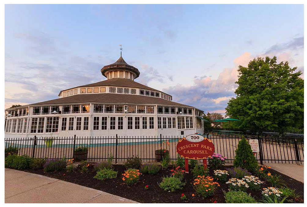
One of the first things I had to figure out with my design was in regards to what I would be basing the design off of. After some careful consideration I eventually chose to use the Crescent Park Carousel as my inspiration and reference for a logo, since it is regarded as a town landmark. I would then use the reference photo of the carousel building to select my color palate for logo creation.
A vast majority of the design process for the town logo was simply attempting to select a design and style that I agreed with and felt was appropriate for a logo such as this.
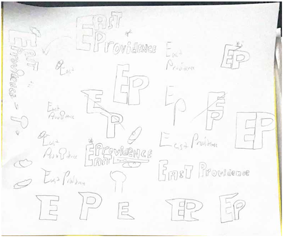
Reviewing the sketches quickly lead to me selecting one of the designs and beginning creation of it in Adobe Illustrator, though I continued to attempt to improve the design during this process, which eventually lead me to the final design, which I felt was more thematically appropriate and less weight heavy than existing concepts.
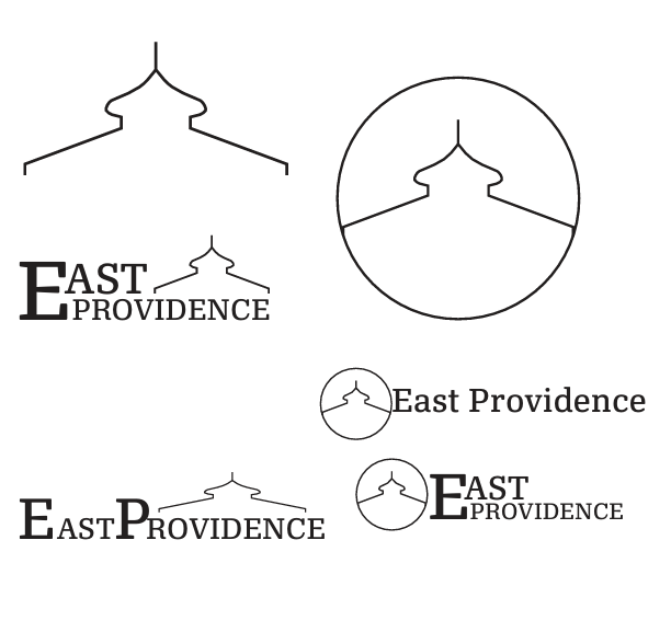
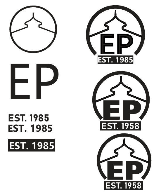
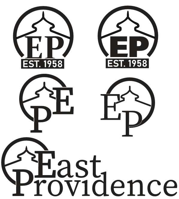
Eventually I would result in the final design, which was much softer in terms of how much of the logo was filled with color and iconography, creating an almost simplicity that was still rather complex and intricate. I then went back to my reference material to decide a color scheme, which I quickly decided would be a red and gold palate, matching the design of the reference in question.