The Moody Brewer Rebrand Case Study

Objective
The objective of this task was to create a fresh and new logo design for “The Moody Brewer” that was unique, distinctive, and reflected their brand as a whole.

The Process
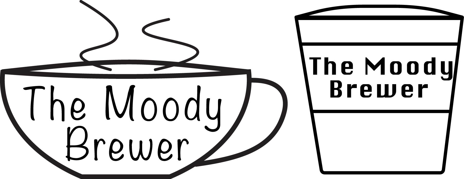
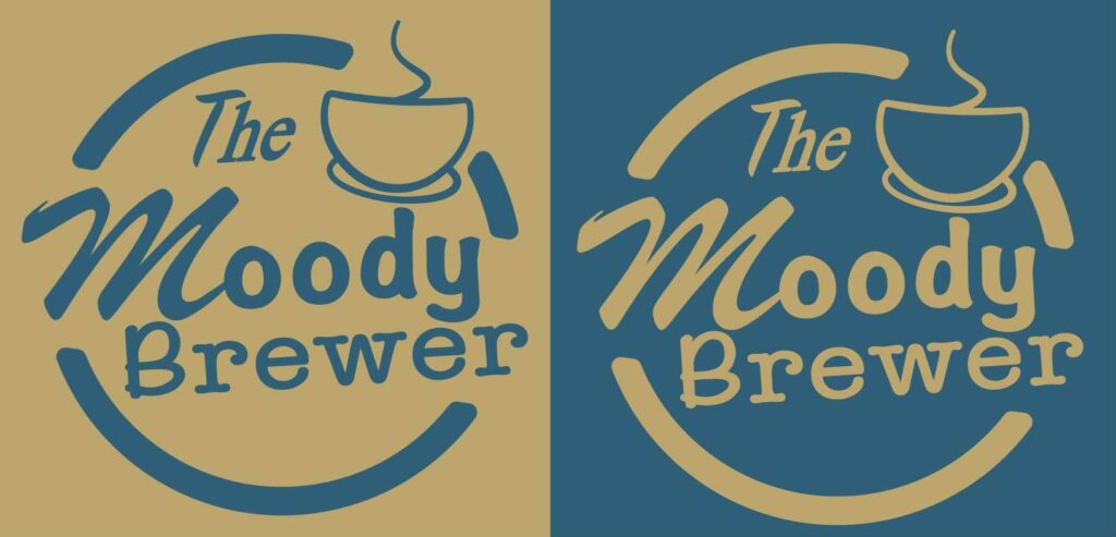
Initially I attempted to gather information from their website and socials. While their website did not yield any valuable information, their social media platforms did provide insight as to what type of marketing style they were gunning for. So my original concepts involved trying to appeal to a more conventional design of a coffee cup, and the design of a more “modern” coffee cup. Both of these designs would be rejected, and something more similar to their original logo, creating the final design.

Reflection
Overall this design process was insightful for me about specific art styles, and creating a unique but also a “fun” design, expressing the subject without being too copy and paste or generic. Including providing colors that are not just generic browns and greens, but rather striking and soft hued blues and golds. Creating a friendly atmosphere that draws audiences in.
